When you step into a room, before you even notice the furniture or the layout, the first element that impacts your mood is color. Paint tones can energize, calm, inspire, or even make a space feel larger or cozier. Choosing the right palette goes far beyond personal taste—it’s about understanding the science of color psychology, light reflection, and how hues interact with one another. By making thoughtful paint choices, you can create a home environment that not only looks beautiful but also feels harmonious.
Why Color Matters in Home Design
Color is more than just a visual experience; it directly affects how we feel and behave. Studies in color psychology show that certain hues can trigger emotional and physical responses. For example, blue tones tend to lower heart rates and promote calmness, while bold reds can stimulate energy and even appetite. This is why restaurants often use red in their décor, while spas lean into muted greens and soft blues.
In a home setting, paint color sets the tone for how you experience each room. It can make a small space feel larger, a large space feel cozier, or a dark room feel brighter. The right tones also enhance natural light, complement furniture, and create visual flow throughout the house.
Understanding the Color Wheel
Before diving into room-by-room recommendations, it helps to understand the color wheel. Primary colors (red, blue, and yellow) are the foundation, while secondary colors (green, orange, and purple) are formed by mixing them. From there, tertiary colors emerge, giving us a full spectrum to play with. Complementary colors sit opposite each other, creating bold contrast, while analogous colors sit side by side, providing soft harmony.
Knowing where a color sits on the wheel helps you determine whether it will energize or soothe a space. Warm tones like red, orange, and yellow create coziness and vibrancy, while cool tones like blue, green, and violet evoke serenity and openness.
The Role of Light
Lighting plays a major role in how paint appears. A soft gray that looks calming in a room with natural sunlight might appear flat or even cold under artificial fluorescent light. When choosing paint, test swatches at different times of day. Morning light, afternoon sun, and evening lamps all shift how a color is perceived. South-facing rooms tend to bring out the warmth in colors, while north-facing rooms can make them appear cooler.
Choosing Paint Tones Room by Room
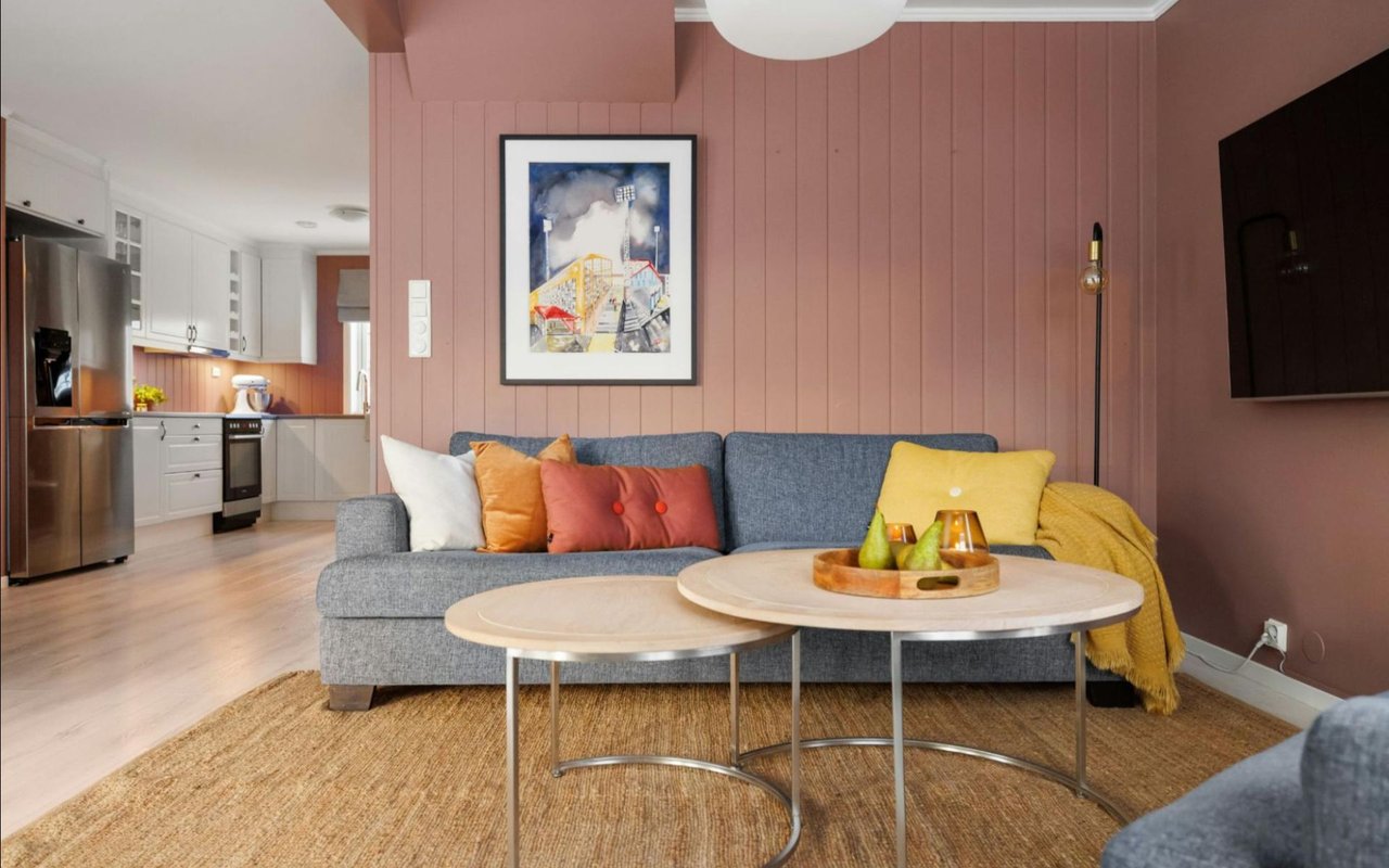
Living Room: Welcoming and Versatile
Your living room is the heart of the home and often serves multiple purposes—entertaining, relaxing, or spending time with family. Neutral tones like soft beige, taupe, or light gray are popular because they allow flexibility with décor while creating a welcoming backdrop. If you want more warmth, try muted earth tones like terracotta or sage green, which add character without overwhelming the space.
Accent walls can be powerful in a living room. A deep navy or forest green on one wall can create a focal point while keeping the rest of the room airy and light.
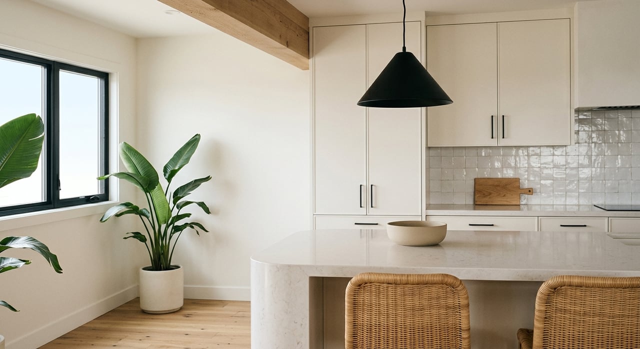
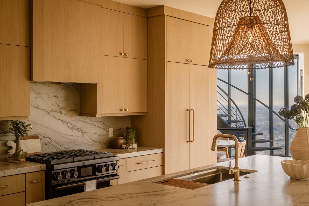
Kitchen: Energy and Appetite
The kitchen is a hub of activity, and color can help make it both functional and inviting. Warm colors like sunny yellows, brick reds, or even soft oranges stimulate energy and appetite. For a more modern, clean aesthetic, crisp whites or cool grays work beautifully when paired with bold cabinet colors or a colorful backsplash.
If you have an open-concept home, choose tones that transition seamlessly into your living or dining areas. This creates visual cohesion and flow.
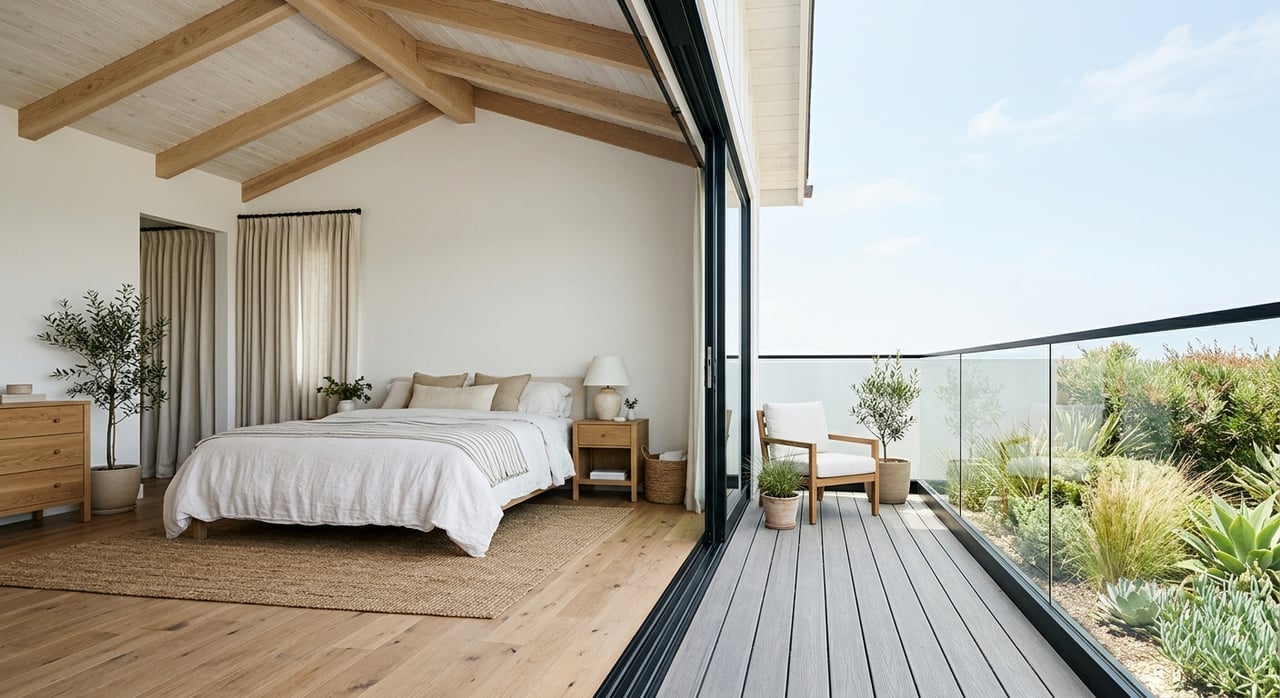
Bedroom: Calm and Restful
Bedrooms are retreats, so color choices should focus on rest and tranquility. Cool tones like soft blues, lavenders, and muted greens are ideal for encouraging relaxation and better sleep. Neutrals such as creamy whites and warm grays can also create a soothing atmosphere, especially when layered with soft textiles and natural wood tones.
If you love darker shades, deep charcoal or navy can work beautifully in a bedroom, creating a cocoon-like effect that feels cozy rather than overwhelming when paired with lighter accents.
Bathroom: Fresh and Bright
Bathrooms benefit from colors that feel clean and refreshing. Whites, light blues, and seafoam greens evoke a spa-like experience. Pale grays can also look elegant, especially when paired with marble or modern fixtures. Since bathrooms are often smaller, lighter tones help open up the space and reflect light effectively.
For a dramatic look, consider rich jewel tones like emerald or teal in a powder room. These small spaces can handle bold choices without feeling overwhelming.
Home Office: Productivity and Focus
With more people working from home, the office deserves special attention. Colors that stimulate focus without being distracting are key. Shades of blue are known to increase productivity, while greens reduce eye strain and bring balance. If your work is creative, splashes of yellow can inspire innovation and energy.
Keep in mind that your office is often visible on video calls, so choosing a professional yet inviting background color can also help your virtual presence.
Dining Room: Conversation and Warmth
Dining rooms are perfect for experimenting with bold, dramatic hues. Rich reds, deep plums, or even dark greens can make the space feel intimate and encourage lively conversation. If you prefer something lighter, soft neutrals paired with statement lighting can create an elegant dining atmosphere.
Hallways and Transitional Spaces: Cohesion and Flow
Hallways and entryways set the stage for the rest of the home. Neutrals like warm whites or light grays create a sense of continuity and allow adjoining rooms to stand out. These spaces are also great for showcasing art, so a subtle background tone is often the best choice.
Practical Tips for Choosing Paint Colors
- Always sample first: Paint swatches on walls and observe them at different times of day.
- Think about flow: Rooms should transition smoothly. Even if colors differ, keep undertones consistent.
- Balance bold choices: Use stronger colors sparingly and balance them with neutrals.
- Consider the ceiling: Painting a ceiling in a lighter shade than the walls can make a room feel taller.
- Match with existing décor: Consider flooring, furniture, and natural elements like wood or stone.
Final Thoughts: Designing with Intention
Choosing paint tones is both an art and a science. By understanding how colors influence mood, how they interact with light, and how they serve specific functions in each room, you can create a home that feels cohesive, inviting, and tailored to your lifestyle. The right color palette not only enhances aesthetics but also improves your daily living experience.
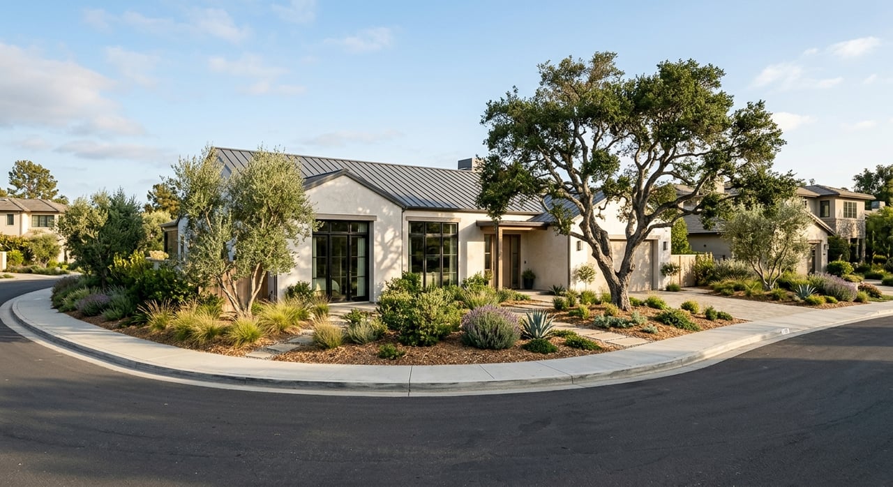
Ready to Find a Home You’ll Love?
Of course, paint colors are only one piece of the puzzle when it comes to creating your dream home. The right property in the right location sets the stage for all your design choices. If you’re ready to explore Newport Beach real estate and find a home that perfectly suits your lifestyle, connect with
Cassie French, your trusted Newport Beach real estate expert. With deep local knowledge and a passion for helping clients create spaces they love, Cassie can guide you through every step of the buying or selling process. Reach out today and start building the home of your dreams.